Users of Google Duo will might experience seeing a new user interface as Google's video calling software is receiving an overhaul for their home screen.
This user interface overhaul, according to News18.com, will also feature the addition of the "New Call" button as well as other tweaks for the video calling service.
How Does the New UI Works
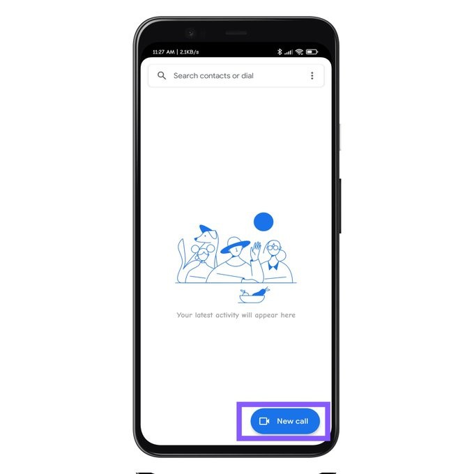
The said "New Call" button in Google Duo's new user interface, according to 9to5Google.com, will serve as a starting point for any key actions in the Duo, which includes starting calls to its other users and contact groups. This also includes their connected Assistant/Home devices, like smart screens and speakers.
#Google Duo added a "New call" button as well as some UI tweaks. pic.twitter.com/hWesK9nf9H
— Saadh Jawwadh (@SaadhJawwadh) August 9, 2021
It is also able to see, and invite, said contacts and create said contact groups by simply tapping the "New Call" button and clicking the "Create Group" tab. According to Indian Express, users may also discover other existing contacts and groups either through Search or via the "New Call" entry point.
Read also: Snap Camera 'Cartoon Style' Filter: How to Use it to Turn Your Face into a Cartoon Character
They can also invite others to Google Duo by tapping the same button then searching for its details either in the contact list or through the search bar. If they are not on Duo, users can also invite them by tapping the blue invite button next to their name.
Aside from the new button, another featured in Good Duo that was tweaked is the one regarding sending video messages.
According to PhoneArena.com, with just a tap of the "New Call" button, users can now select the person or the contact group that they want to receive their video message and then record it instead of painstakingly record the video first then selecting the recipient(s) after.
With the integration of all of the Google Duo's functions in one button, its new user interface was redesigned, removing the few functionalities that was integrated in the said button, and making it look better organized and cleaner than before.
Other Google Services Tweaked
Aside from Google Duo, Google Podcasts is also receiving a major design refresh. This is after several usability complaints from its users regarding the podcasting service.
According to Technosports, the userface for Podcasts will have revamped names to begin with. The "Home" tab becomes the "Subscriptions" tab, in which Google was allowed to add a "More" tab that open a grid view, revealing the shows and podcasts the service's users are following.
Also, a show or podcast's episode card was seen, but with an overflow menu in the bottom right corner, where it has a "Share" and "Mark as played" tabs.
Its "Explore" tab remains unchanged, however the Podcasts watermark that is in the tab replaced the red "Beta" tag for all of its users, while the "Activity" tab is replaced with "Librtary," removing the former's four subtabs - "Your Queue," "Downloads," "History," and "Subscriptions."
According to News18.com, Google is now focused on improving productivity and communication capabilities with their video-based apps and services, especially in the midst of the Covid-19 pandemic.
Google is pushing its Google Meet as its primary software for video conferences while it reworked its G-Suite professional and productivity tools into Google Workspace, interlinking them in a more practical and user-friendly matter.


